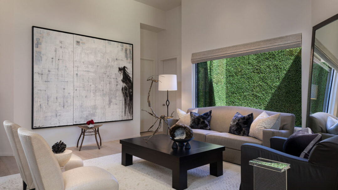
A Bay Colony Dreamscape
share
From the moment Candace Moeller walked into the 2,883-square-foot home in Bay Colony’s Villa La Palma in 2014, she knew she was home. The three-bedroom, three-and-a-half-bathroom residence had everything she could need to live the perfect Florida lifestyle with her significant other and 91-year-old mother, who both live with her in the home.
But after settling in, Moeller was underwhelmed. The place didn’t exactly reflect her personality, so she turned to Naples-based interior designer Judith Liegeois to help make every room more “hers.” “My goal was to create an elegant home, while maintaining a warm and inviting space for all who enter,” Moeller says. She longed for wide-open, well-appointed spaces where friends and family would feel welcome and engage with their surroundings.
She couldn’t have chosen a better team for the task. While Testard got to work drawing up a design that would make the rooms less confined and better suited for mingling, Liegeois made plans to layer in tons of texture to create warmth and better showcase Moeller’s art collection. “Each material, piece of furniture and decorative object was carefully selected, not only with a visual sense but also a tactile one,” the designer says. Liegeois and Testard mixed a primarily white palette with an abundance of natural light and intriguing architectural elements.
Because the 2.0 version of the villa was all about socializing, the powder room was high on the list of must-changes. After all, it’s the one spot a guest is all but assured to visit, so the designers took the challenge seriously. “Even the tiniest half bathroom can be a magnificent space to experiment with pattern, color and texture,” Liegeois notes. She went bold by covering the walls with a custom Swiss-made floral wallpaper and added a smoked mirror for unexpected drama. Glam touches like the Rocky Mountain brass sink, which sits atop a custom vanity, and a 1930s Italian chandelier add warmth to the space. The bedrooms were conceived to be equally artistic. The mother’s suite features bespoke nightstands (designed by Liegeois) and a custom bed with a smoked mirror headboard that subtly expands the room. Ran Adler artwork draws the eye toward the 12-foot-high ceiling, and each nightstand features vintage Murano glass lamps in a golden hue to complement artwork by Leland Brinkman. There are blown-glass vases inlaid with 24-karat gold by local glass artist Conrad Williams on the shelves and a Liegeois-designed flower vessel on the desk. In another room, the custom cabinets were configured to be an integral part of the design. “The cabinetry beautifully embraces artwork by local craftsmen and is coordinated with the colors of the bed and furniture,” Liegeois explains. The designer likes to combine the practical and the pretty, and here she did so by topping built-in storage with a lamp by artist Kate Tremel.
But the area where Moeller’s love for hosting is most evident is the kitchen and dining area. Because the size of the kitchen was far from grand, the team had to be smart about how to use the limited square footage. To that end, they created hidden storage units, which stand to the left of open shelves against the kitchen wall. The kitchen island—always the most popular place for people to gather at any party—is topped with a Cristallo quartzite, a rare and exotic stone that originates from quarries in Brazil. Although Moeller was initially concerned about the lack of color and warmth in the space, once the designers found the right shade of soft gray paint for the kitchen, she was sold. “My glass backsplash adds elegance, yet makes a stunning statement of beauty and simplicity. The striking, oversized island with the waterfall effect functions as a six-person seated intimate area for dining within the heart of the kitchen,” she says.
When she’s hosting more formal affairs, Moeller delights in ushering people to her dining area under the mood lighting provided by a delicate floating branch chandelier. Guests are seated at a large liveedge community table, which stands at 37 inches high (about counter level) to create a sense of continuity from the kitchen island through to the glass-enclosed wine wall. The table doubles as a wine-tasting area, and a display cabinet holds an elegant selection of fine glassware and china. “The table base was custom designed to produce an interesting texture and counterbalance the sleek modernity of the glass in the cellar, and the display cabinet that shows Moeller’s exquisite range of home accessories,” Liegeois says.
As an avid oenophile, Moeller had a lot to contribute to the floor-to-ceiling wine cellar—and not only bottles of interesting vintages. She knew the space had to be visible and integrate seamlessly with the areas around it. Testard listened to her ideas and introduced touches that did just that, including using the kitchen counter stone on the floor of the wine room and smoothly transitioning to the hardwood floors of the kitchen. “The different colors, textures and sizes of the wine bottles create a piece of art on the wall. It was important to display Candace’s extravagant collection instead of hiding it behind closed doors,” Testard says.
Moeller says that she appreciates that no detail was overlooked and now she feels that every square inch belongs to her and is fit for sharing with friends old and new. “I definitely knew what I wanted, but together, Antoine and Judith took it to another level,” she says.


Story Credits:
Featured in Gulfshore Life HOME
Interior Design by Judith Liegeois, Judith Liegeois Designs, Naples, FL
Photography by Lori Hamilton, Naples, FL